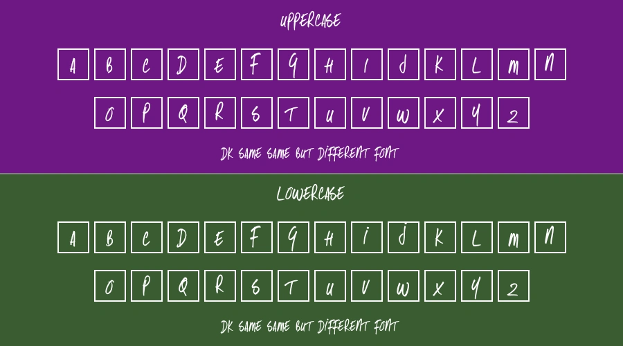
About DK Same Same But Different Font
When typographic excellence matters most, DK Same Same But Different Font delivers through its thoughtful blend of assertive angles and reliability. Specially crafted for advertising campaigns, it offers the longevity and market relevance required for sophisticated design work. Every detail serves a purpose.
The character set showcases thoughtful details like flourished entries alongside functional initial forms. This proves especially valuable in creative titles, where color application directly influences results. Particular attention was paid to letterfit and creative versatility during development.
Font Details
| Font Name: |
DK Same Same But Different Font |
| Format: |
TTF |
| Version: |
1.0 |
CHARACTERISTICS
| Weight Range: |
Regular |
| Width: |
Normal |
| Contrast: |
Medium |
| x-height: |
Medium |
| Ascenders/Descenders: |
Standard |
| Italic: |
No |
| OpenType Features: |
Basic |
TECHNICAL SPECIFICATIONS
| Glyph Count: |
265 characters |
| Kerning Pairs: |
548 |
| Hinting: |
Auto-hinted |
| Alternates: |
Limited |
| Ligatures: |
Standard |
| Unicode Coverage: |
Basic Latin, Latin-1 Supplement |
LANGUAGE SUPPORT
| Basic Latin |
English, Spanish, French, German, Italian |
| Extended Latin |
Not supported |
| Cyrillic |
Not supported |
| Greek |
Not supported |

 Free for Personal Use
 Fancy
Fancy
 Free for Personal Use
 Free for Personal Use
 Free for Personal Use
 Sans serif
 Free for Personal Use
 Free for Personal Use
 Free for Personal Use
 Free for Personal Use
 Free for Personal Use
 Free for Personal Use